a first experience
when i started working at illini hillel, there was no clear visual brand across any of the platforms.
coming in as a first time graphic designer, this was extremely challenging. how could i make it all cohesive? what was the vision for the brand? what were they trying to communicate? without these things clearly established by the organization, i realized there was an opportunity for me to develop a visual brand from scratch.
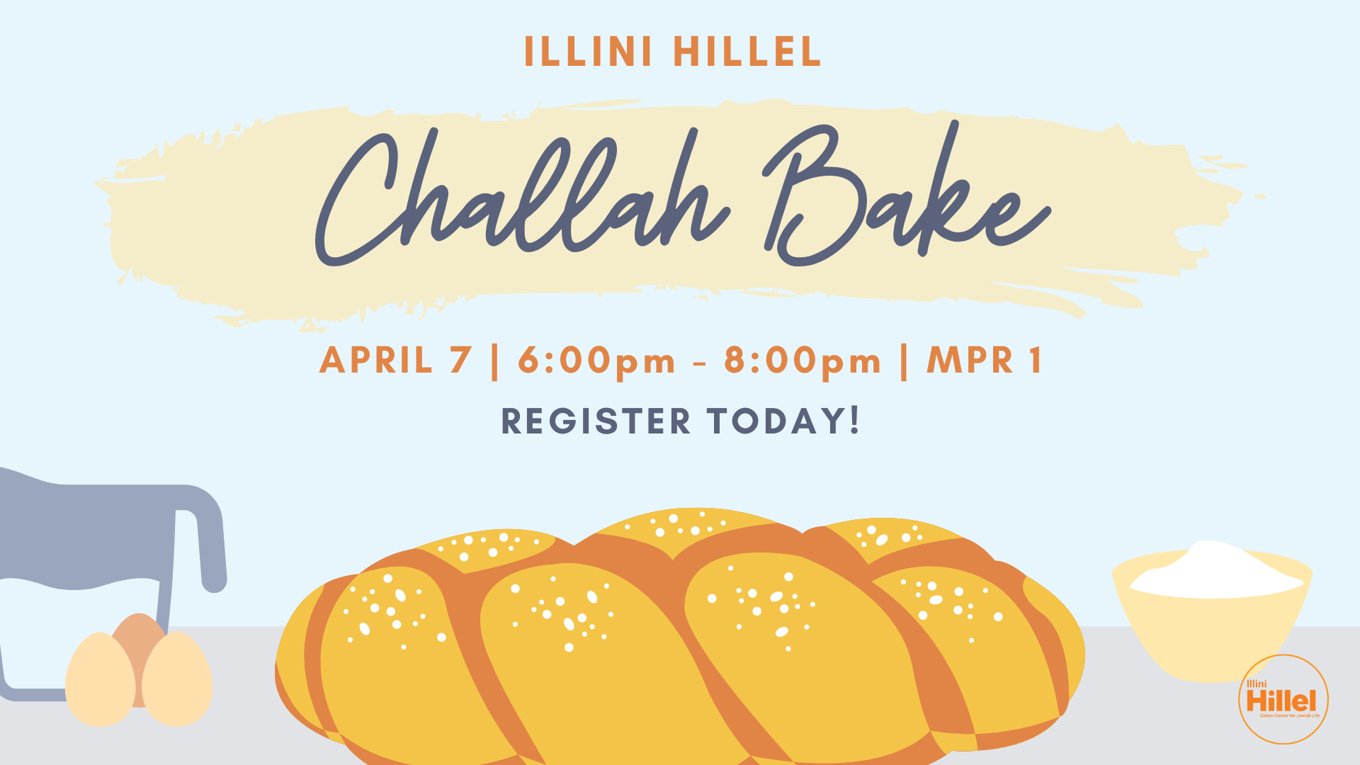
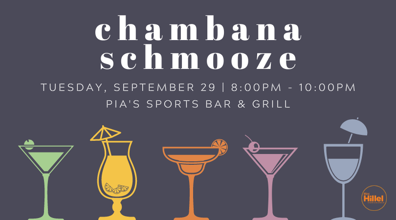
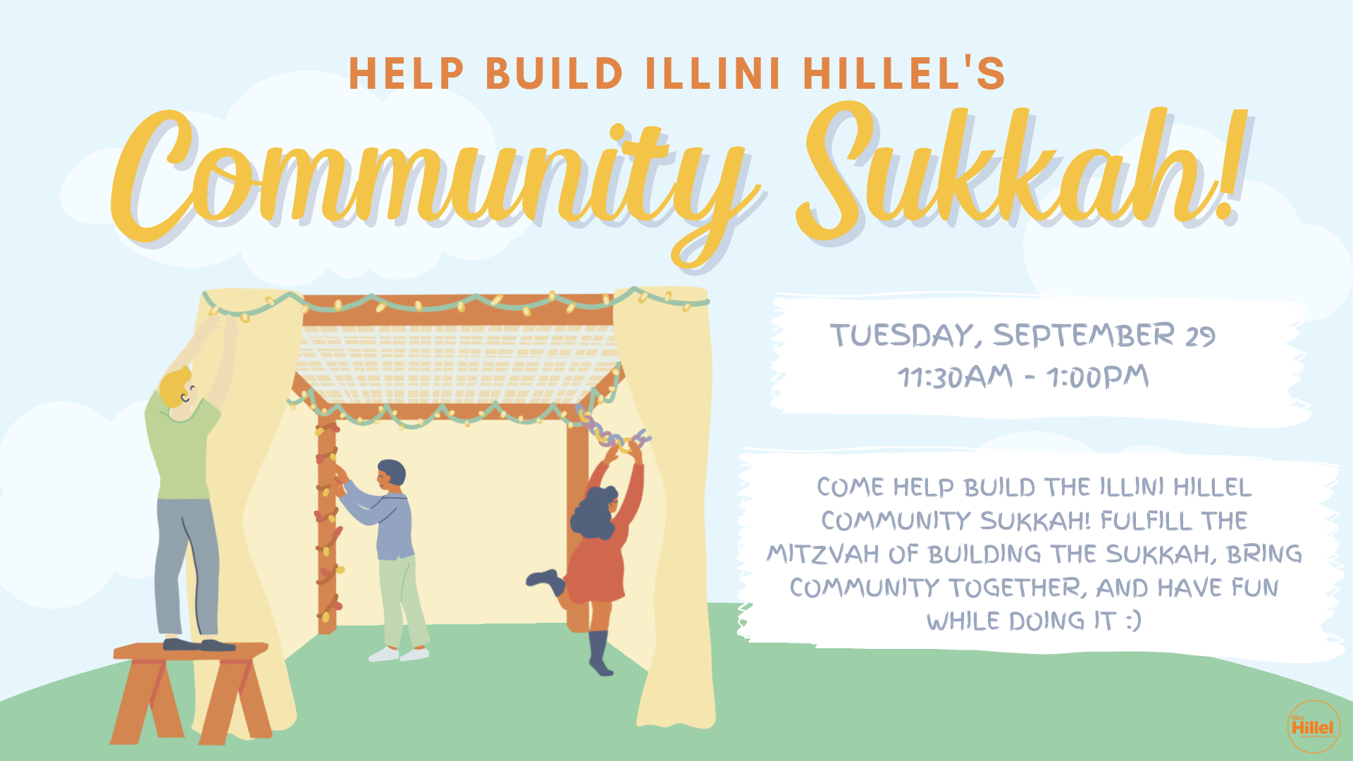
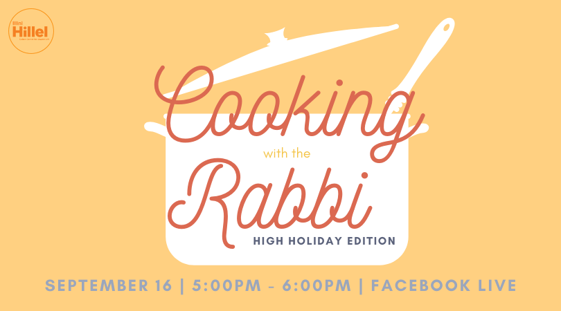
some examples of previous hillel graphics made by a variety of previous interns


first steps
i broke down the goals of what i wanted the hillel brand to convey. in the end it was simple —
friendly
community-oriented
fun
educational
further development
with the basic goals of the brand in mind, i started to break down the things that i would need — color palette, shape, fonts and typography, and what kind of imagery. there were multiple elements at play - what would be fun, but also communicate the necessary information? what would attract college-aged students without seeming juvenile? what kind of visual brand would also be able to translate across the entire organization and be able to be replicated by multiple people? there were dozens of these questions that came to mind, and having always been a visual learner, i turned to visual solutions.
here, you can see the web i created to break down everything i wanted to keep in mind when developing the brand. understanding the primary, secondary, and tertiary audiences was key to making decisions about what the visual aspects would be.


keeping in mind that the primary audience was university aged students, making something that was eye-catching and would stand out on social media platforms was key. limiting use of photos would allow graphics to be visually different on instagram, while a consistent color palette and typeface would make events pop on Facebook and twitter where visual formatting is limited to imagery.
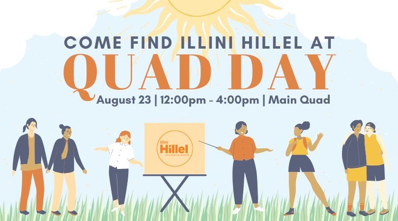
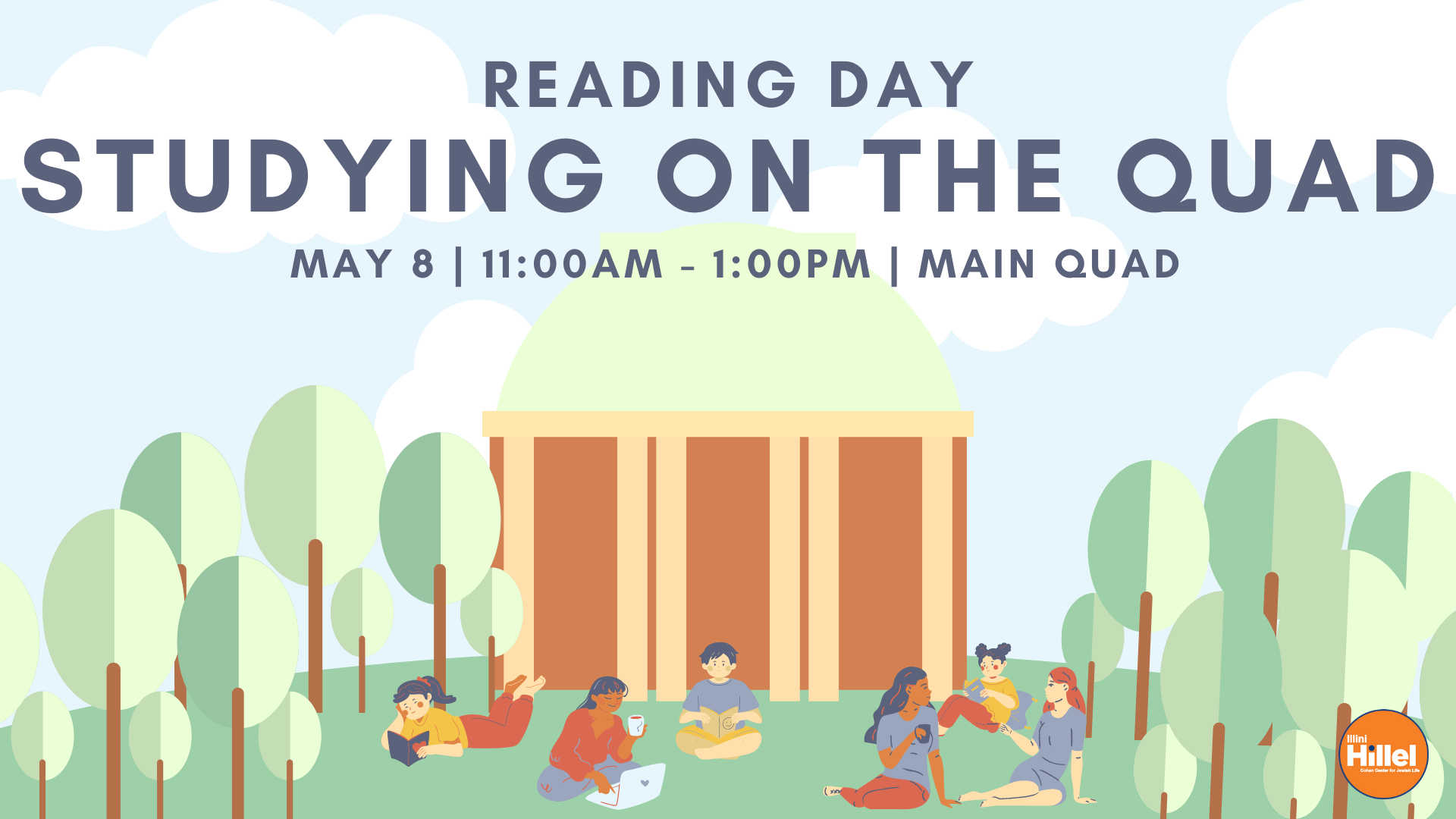
choosing a sans serif bold font allowed for quick and easy processing of key information, while more fun typefaces would be used for titles to give individual events their own personality.
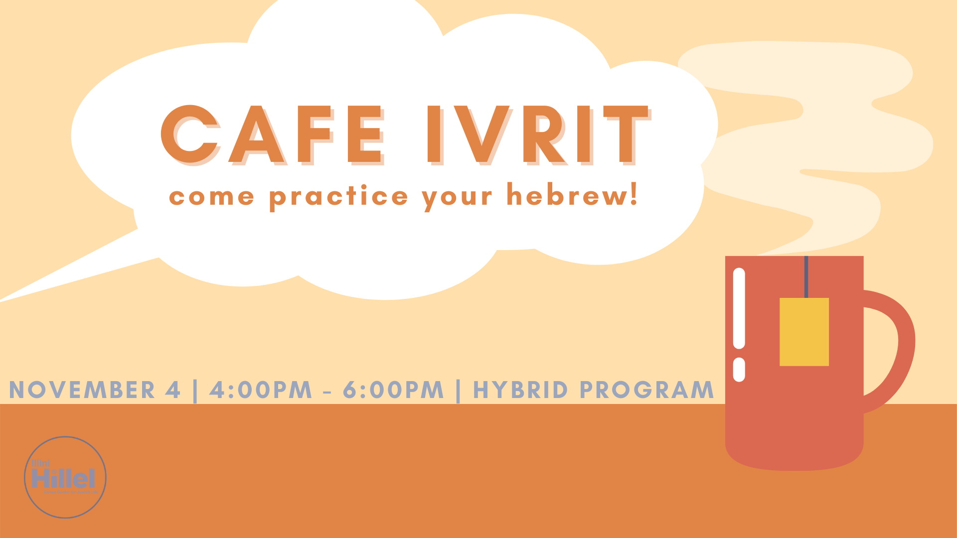
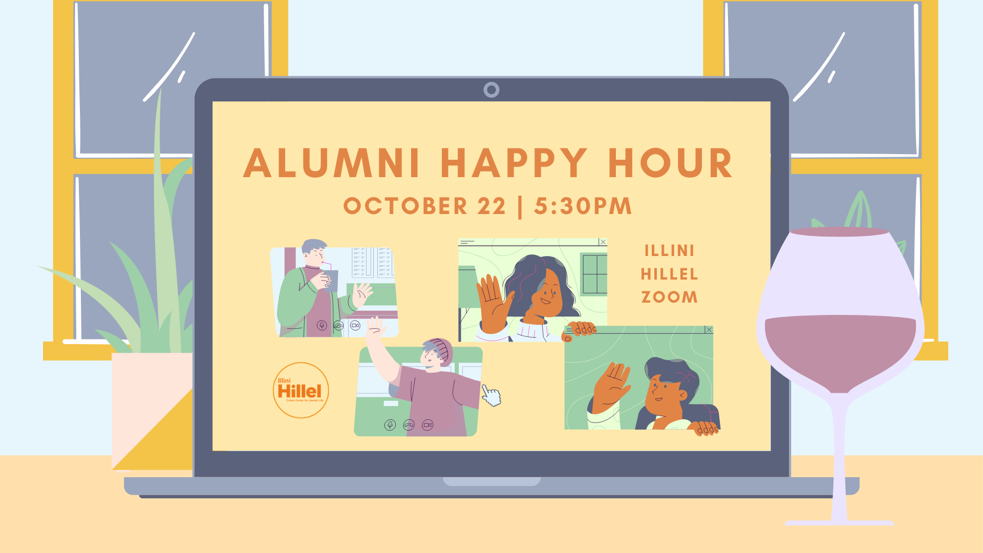
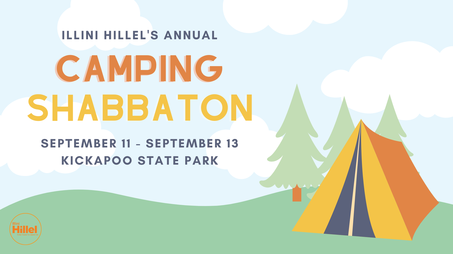
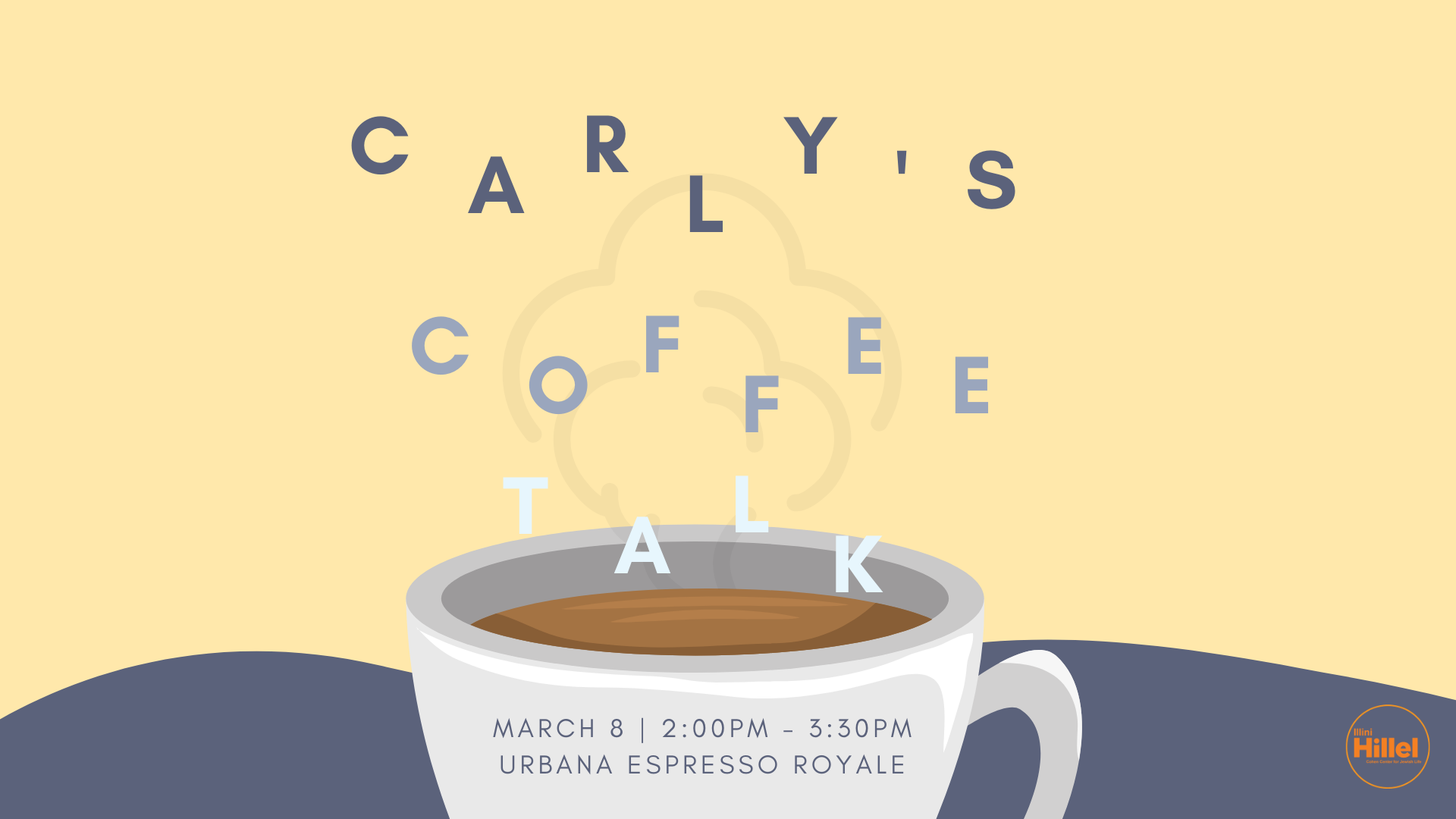
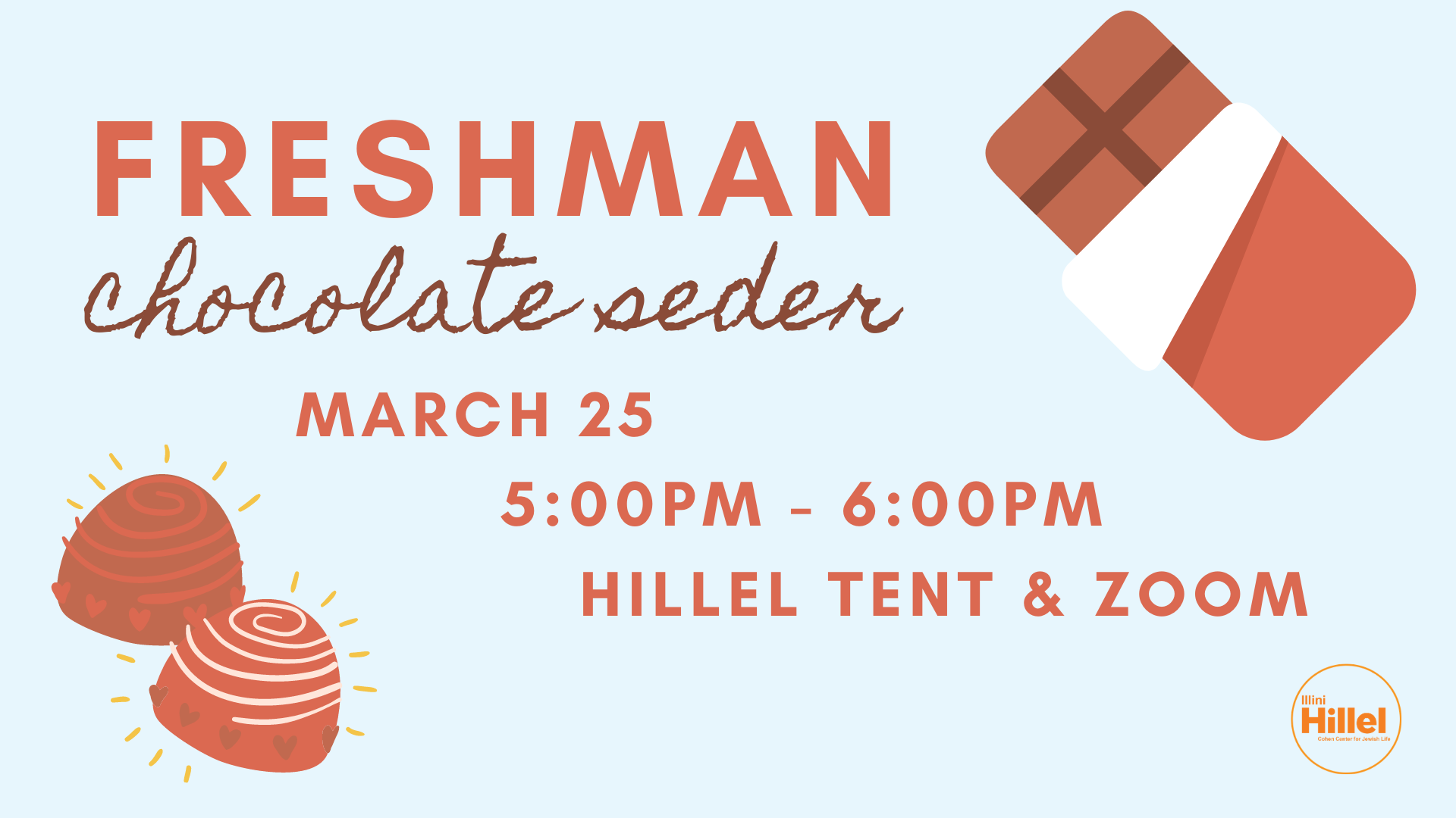
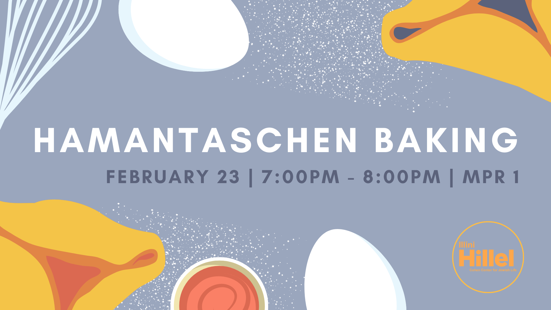
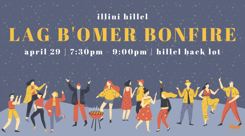
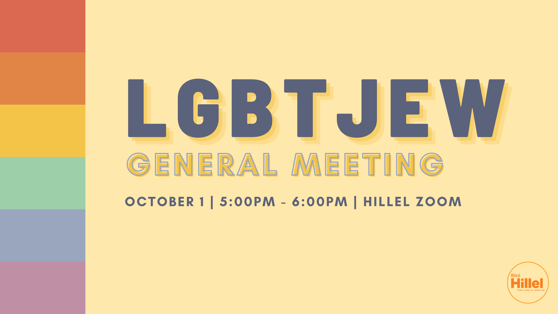
the final brand design was clean, muted but colorful, and friendly.
final brand design
